Hampus Malmström

Design system

The living design system for hampusmalmstrom.se. Everything here is built from the same code as the site: the tokens are read straight from app/globals.css and the components are the real ones. The rules are in MLMSTRM.md – this page shows how they are built right now. Component names are exactly the ones in MLMSTRM.md.

Every component is shown in light and dark mode side by side. The page around them follows the mode switch at the top right.

Tokens

Color names

Fixed hex codes, the same in both modes. Components use roles – color names only in filled accent boxes.

  • offwhite#FAFAFA
  • charcoal#333333
  • teal#377771
  • plum#4B2E39
  • wine#32021F
  • mint#A9D8B8
  • pastel#BEFFC7
  • tint#E6F2EA
  • graphite#3D3D3D
  • silver#CCCCCC
  • plum-light#A5979C
  • wine-light#846779
Color roles in light and dark mode
RoleLight modeDark mode
--bgoffwhitecharcoal
--surfacetintgraphite
--textcharcoaloffwhite
--text-mutedplumsilver
--text-secondarycharcoalsilver
--subtitleplumoffwhite
--primarytealpastel
--metatealpastel
--accent-linemintteal
--accent-line-softmintmint
--button-bgtealpastel
--button-textoffwhitecharcoal
--button-hover-bgpasteloffwhite
--button-hover-textcharcoalcharcoal
--highlightpastelpastel
--dot-1tealteal
--dot-2plumplum-light
--dot-3mintpastel
--dot-4winewine-light
--dot-5charcoaloffwhite
--card-titleplumoffwhite
--tag-textplumpastel
--card-bgtransparentgraphite
--card-borderminttransparent
--number-4-bgtintgraphite
--number-4-textcharcoaloffwhite
--number-4-noteplumpastel
Mode switches – what differs between the modes without being a color
TokenLight modeDark modeUse
--when-lightblocknonedisplay for things that only show in light mode (birds, sun icon)
--when-darknoneblock…and for things that only show in dark mode
--knob-x0px32pxthe mode switch knob: on the left
--is-light(empty)initialPicks values that come from the element itself (toneDark)
--is-darkinitial(empty)Picks values that come from the element itself (toneDark)
Fonts
TokenValuepx and use
--sansvar(--font-montserrat), "Montserrat", system-ui, sans-serif–
--sans-italicvar(--font-montserrat-italic), "Montserrat", system-ui, sans-serif–
--serifvar(--font-gelasio), Georgia, serif–
--serif-italicvar(--font-gelasio-italic), Georgia, serif–
Type scale
TokenValuepx and useExample
--fs-xs0.75rem12 – tags, source lines, meta lines in cards, legendAa
--fs-sm0.875rem14 – metarader, navigation, statusrad, eyebrow, footerAa
--fs-body-sm1rem16 – text in cards and lists, text linksAa
--fs-body1.0625rem17 – body text, buttons, traitsAa
--fs-lead1.1875rem19 – lead text, small card titlesAa
--fs-title1.375rem22 – kortrubriker, arbetsgivareAa
--fs-stat2.125rem34 – WoW-namnetAa
--fs-heroclamp(2rem, min(15cqi, max(3.25rem, 7.4vw)), 7rem)32–112, cqi = hero-kolumnenAa
--fs-sectionclamp(2.5rem, 5.4vw, 4.75rem)40–76Aa
--fs-displayclamp(2.5rem, 4.8vw, 4.25rem)40–68Aa
--fs-hero-subclamp(1.1875rem, 1.8vw, 1.5625rem)19–25Aa
--fs-contact-labelclamp(1.0625rem, 1.6vw, 1.3125rem)17–21Aa
--fs-contact-valueclamp(0.9375rem, 1.5vw, 1.1875rem)15–19Aa
Line height
TokenValuepx and use
--lh-hero0.95–
--lh-display1–
--lh-heading1.25–
--lh-snug1.4–
--lh-text1.6–
--lh-long1.7–
Spacing
TokenValuepx and useExample
--space-10.25rem4
--space-20.5rem8
--space-30.75rem12
--space-41rem16
--space-51.5rem24
--space-62rem32
--space-73rem48
--space-84rem64
Spacing, fluid and layout (including --space-block)
TokenValuepx and useExample
--card-padvar(--space-5)–
--gutterclamp(1.25rem, 4vw, 3rem)20–48 – page margin (20 px from 500 px width, 48 px at 1200 px)
--max77.5rem1240 px
--spaceclamp(2.5rem, 5vw, 4.5rem)40–72 – luft mellan sektioner, luft under kontaktblocket
--space-blockclamp(1.5rem, 4.5vw, 4rem)24–64 – inner space in large blocks and surfaces, space above the hero
Radii – the leaf shape is always written 0 R 0 R
TokenValuepx and useExample
--r-xs0.5rem8
--r-sm0.75rem12
--r-md1rem16
--r-lg1.5rem24
--r-xl2rem32
--r-2xl3rem48
--r-portrait5.5rem88
Motion
TokenValuepx and use
--dur-hover150mshover and focus
--dur-pulse3200mspulse of the live dot, one cycle (loops)
--ease-outease-out–

Typography

Montserrat for the name, headings and UI text; Gelasio for body text. Shown in the page’s current mode.

  • The name · Montserrat Black 900, uppercase, --fs-hero (32–112), --lh-hero, --primary

    Hejsan, I’mHampus.

  • Hero subtitle · Montserrat Bold 700, --fs-hero-sub (19–25), --lh-snug, --subtitle, max 34ch

    Digital marketing & business development.

  • Section title · Montserrat Black 900, uppercase, --fs-section (40–76), compact --fs-display (40–68), --primary

    Experience

  • Card title · Montserrat ExtraBold 800, --fs-title (22), --card-title

    Warehouse Manager

  • Employer · Montserrat Bold 700, --fs-title (22), --text

    Emirates Holidays

  • Lead text · Gelasio Regular 400, --fs-lead (19), --lh-text

    A few things I’ve built, launched and learned from along the way.

  • Body text · Gelasio Regular 400 and Italic, --fs-body (17), --lh-long, max 65ch

    Digital marketer and business developer based in Helsingborg, Sweden, where I live with my cat Tusse. 15 years in retail, travel and hospitality.

  • Meta line · Montserrat Medium Italic 500, --fs-sm (14), --meta

    2019 – 2025

  • Eyebrow · Montserrat Bold 700, uppercase, --fs-sm (14), letter-spacing 0.08em, --text-muted

    Very important numbers

  • UI text · Montserrat SemiBold 600, --fs-sm (14) – navigation, status, tags, tools

    About · Experience · Contact

Components

In the same order as the component table in MLMSTRM.md. Components that are hidden on the home page (the story cards and Off the clock) are shown here too.

  • Header

    Purpose
    Sticky top navigation with the name, anchor links to the sections and the mode switch. The links are /#about and so on, so they also work from sub-pages such as the 404 page.
    Tokens
    Background --bg. 1 px line in --accent-line below once the page has been scrolled. The name --primary, --fs-sm ExtraBold, letter-spacing 0.08em. Links --text, --fs-sm SemiBold, hover (mouse only) --primary with a 2 px underline 6 px from the text in --accent-line. Inner space --space-5, below 48rem --space-3.
    Variants
    Not scrolled (no line) and scrolled (line – visible here because the page is scrolled). Below 48rem the links move to their own row under the name and the switch.

    Light mode

    Dark mode

  • Mode switch

    Purpose
    Switches between light and dark mode for the whole site (role="switch", label "Dark mode"). The choice is saved in the browser.
    Tokens
    Track 76 × 44 px, 2 px border in --accent-line, --r-md. Knob 36 × 36 px, 4 px from the edge, --r-sm, filled with --button-bg and an icon in --button-text (Lucide Sun/Moon, 18 px, stroke width 1.75). The knob position is --knob-x.
    Variants
    Light: sun on the left. Dark: moon on the right. Hover: the knob in --button-hover-bg with the icon in --button-hover-text. Slides in --dur-hover; with reduced motion it changes place without sliding. No colors fade during the mode change itself (the class theme-switching on <html> turns the transitions off for two frames, the knob excepted).

    Light mode

    Dark mode

  • Section title

    Purpose
    The heading of each section, with the signature: the bar right below.
    Tokens
    Montserrat Black, uppercase, --fs-section, --lh-display, --primary. Bar 72 × 7 px in --accent-line, --space-4 above.
    Variants
    Compact with --fs-display (Experience, Tools, the 404 page). In the contact block offwhite – the bar keeps --accent-line. It is an h2 by default; the 404 page uses h1.

    Light mode

    This is me

    Tools

    Dark mode

    This is me

    Tools

  • Eyebrow

    Purpose
    Small uppercase label above content that needs a heading but not a section title.
    Tokens
    Montserrat Bold, --fs-sm, letter-spacing 0.08em, uppercase, --text-muted. Leaf 14 px with --space-3 between.
    Variants
    With a leaf (Very important numbers) or without. Pastel in the WoW card.

    Light mode

    Very important numbers

    Dark mode

    Very important numbers

  • Card title

    Purpose
    Heading in cards and widgets.
    Tokens
    Montserrat ExtraBold, --fs-title, --card-title.
    Variants
    Small variant --fs-lead in the story cards. Offwhite in filled widgets.

    Light mode

    Warehouse Manager

    Testing the future of grocery shopping

    Dark mode

    Warehouse Manager

    Testing the future of grocery shopping

  • Meta line

    Purpose
    Metadata: roles, dates, years, short labels. Always via the class .meta.
    Tokens
    Montserrat Medium Italic, --fs-sm, --meta, --lh-heading.
    Variants
    Small variant --fs-xs in cards. Pastel on filled surfaces.

    Light mode

    2019 – 2025

    Emirates Holidays · 2019 – 2025

    Dark mode

    2019 – 2025

    Emirates Holidays · 2019 – 2025

  • Primary button

    Purpose
    The most important action in a view – one per view.
    Tokens
    --button-bg with text in --button-text, Montserrat Bold --fs-body, padding --space-4 / --space-6 (16/32), --r-md.
    Variants
    Hover (mouse only): --button-hover-bg and --button-hover-text, --dur-hover. Focus: the global focus ring.

    Light mode

    Dark mode

  • Arrow button

    Purpose
    Scrolls a row that is longer than the screen (the story cards).
    Tokens
    52 × 52 px (44 px in small mode, like icon box M), --r-md, 2 px border. Clickable: filled with --button-bg, icon in --button-text. Not clickable: only border and icon in --primary.
    Variants
    Hover like the primary button. Disabled at the start and end of the row.

    Light mode

    Dark mode

  • Purpose
    A standalone link that is a clear next step, for example to LinkedIn.
    Tokens
    Montserrat Bold, --fs-body-sm, --primary. Underline 3 px in --accent-line, 6 px from the text. Space --space-3 above and below.
    Variants
    Hover (mouse only): the underline takes the text color. The only 3 px line.
  • Purpose
    New: a link inside running text, such as Naughtypanda.se in This is me. Quiet: it keeps the typeface of the text around it. The Text link is for standalone links.
    Tokens
    Same typeface, size and weight as the surrounding text (Gelasio Regular in body text), --primary. Underline 1 px in --primary, 3 px from the text.
    Variants
    Hover (mouse only): the underline becomes 2 px. Focus: the global focus ring.

    Light mode

    One of them is my webshop Naughtypanda.se, with gifts that have a cheeky twist.

    Dark mode

    One of them is my webshop Naughtypanda.se, with gifts that have a cheeky twist.

  • Purpose
    A quiet link inside cards and lists. Also the footer links to /build and /privacy, the link from /build to this design system and the tool names in Built with.
    Tokens
    Montserrat Bold, --primary, no underline.
    Variants
    Hover (mouse only): 2 px underline in --accent-line, 6 px from the text – the same as the menu. The contact rows use 4 px.

    Light mode

    Dark mode

  • Status line

    Purpose
    A short status line at the top of the hero: what Hampus is looking for right now.
    Tokens
    2 px border in --accent-line, --r-md, padding --space-2 / --space-4. Montserrat SemiBold --fs-sm, --subtitle. Leaf dot in --primary – a deliberate exception from --dot-1…5. The dot is a Live dot.

    Light mode

    Open to new roles in southern Sweden and Copenhagen

    Dark mode

    Open to new roles in southern Sweden and Copenhagen

  • Tag

    Purpose
    Topics on the story cards, and who does a step on /build.
    Tokens
    1 px border in --accent-line, --fs-xs SemiBold, --tag-text, padding --space-1 / --space-2, --r-xs.

    Light mode

    • CRM
    • Market launch
    • Sales leadership

    Dark mode

    • CRM
    • Market launch
    • Sales leadership
  • Tool label S/M/L

    Purpose
    Tools in the Tools cloud. The size shows how much the tool is used.
    Tokens
    No border, background --bg, Montserrat SemiBold. S: --fs-sm, --r-xs, dot 9 px. M: --fs-body-sm, --r-sm, dot 10 px. L: --fs-lead, --r-sm, dot 11 px.
    Variants
    S, M and L. The color of the dot shows the area.

    Light mode

    • Salesforce Marketing Cloud
    • Claude
    • Illustrator

    Dark mode

    • Salesforce Marketing Cloud
    • Claude
    • Illustrator
  • Leaf dot

    Purpose
    A small marker in the leaf shape: traits, tool areas, status.
    Tokens
    .leaf-dot, size via --size (default 10 px), radius 40 % of the size. Color --dot-1…5 by the area’s place in the list. No border, in light and dark mode.
    Variants
    teal, plum, mint, wine and charcoal (dot-1…5). --dot-5 is charcoal in light mode and offwhite in dark mode, for the fifth tool category. 34 px in the traits. 8 px (--dot-2) as the bullet in the Shipped lists.

    Light mode

    Dark mode

  • Live dot

    Purpose
    A variant of the Leaf dot that shows something is current right now. It sits in the Status line in the hero, in the Ongoing row (Courses) and on the Eyebrow of a version in progress in Now & next on /build (changed 2026-10-22: on the version, never on its rows). One Live dot per thing that is in progress – never on both a heading or label and the row below.
    Tokens
    .leaf-dot.live-dot: Leaf dot (10 px) in --primary. 2 px ring in the same color with the dot’s shape (radius 40 % of the size). Used in the Status line, the Ongoing row and the Eyebrow of a version in progress. A planned version gets no dot.
    Variants
    The ring pulses slowly in a loop: one cycle is --dur-pulse (3.2 s) – in the first half the ring grows to 2.4 times its size and fades out, in the second half it rests. No glow. Reduced motion: no ring.

    Light mode

    Open to new roles in southern Sweden and Copenhagen

    In progress: v2.0

    Planned: v2.1

    Dark mode

    Open to new roles in southern Sweden and Copenhagen

    In progress: v2.0

    Planned: v2.1

  • Icon box

    Purpose
    A leaf-shaped box with initials, an icon, a logo or a version number.
    Tokens
    S 34 px with --r-xs. M 52 px (44 px in small mode, below 26rem) with --r-md. The color is set by the context.
    Variants
    S (plum). M with an icon (contact: plum with an icon in pastel). M with a logo – fills the whole box. M with initials as the fallback for employers without a logo (plum, teal or wine). The Version variant is shown further down.

    Light mode

    Dark mode

  • Bordered card

    Purpose
    A card for content with an image: Tusse and the story cards. The story cards are hidden on the home page until v3.0.
    Tokens
    Background --card-bg, 1 px border in --card-border, --r-xl. Inner space --card-pad (--space-5). The story card’s image slot is a toned place (--tone / --tone-dark).
    Variants
    Light mode: transparent with a mint border. Dark mode: graphite with no border. Story cards get arrow buttons when the row is longer than the screen.

    Light mode

    Stories

    Some of the things I’ve been part of building, and what I learned along the way.

    [Image]

    Emirates Holidays · 2019 – 2025

    Building Emirates Holidays in Scandinavia from scratch

    From launch marketing and building the CRM database to leading the Scandinavian sales and service team.

    • CRM
    • Market launch
    • Sales leadership
    [Image]

    Salling Group · Netto · 2016 – 2019

    Testing the future of grocery shopping

    Scan & Go, a Google Assistant test and the Netto app 3.0 concept with AKQA.

    • Product ownership
    • Concept development
    • Jira
    [Image]

    Netto Sverige · [Year]

    [Title: Netto Sverige on Instagram]

    [One sentence: what you did and what came out of it.]

    • Social media
    • [Skill]
    [Image]

    Side project · [Since year]

    Running my own webshop, Naughtypanda.se

    Gifts with a cheeky twist. I run all of it myself, from sourcing to marketing.

    • E-commerce
    • [Platform]

    Dark mode

    Stories

    Some of the things I’ve been part of building, and what I learned along the way.

    [Image]

    Emirates Holidays · 2019 – 2025

    Building Emirates Holidays in Scandinavia from scratch

    From launch marketing and building the CRM database to leading the Scandinavian sales and service team.

    • CRM
    • Market launch
    • Sales leadership
    [Image]

    Salling Group · Netto · 2016 – 2019

    Testing the future of grocery shopping

    Scan & Go, a Google Assistant test and the Netto app 3.0 concept with AKQA.

    • Product ownership
    • Concept development
    • Jira
    [Image]

    Netto Sverige · [Year]

    [Title: Netto Sverige on Instagram]

    [One sentence: what you did and what came out of it.]

    • Social media
    • [Skill]
    [Image]

    Side project · [Since year]

    Running my own webshop, Naughtypanda.se

    Gifts with a cheeky twist. I run all of it myself, from sourcing to marketing.

    • E-commerce
    • [Platform]
  • Surface

    Purpose
    Breaks up the background behind a single box: the text in This is me.
    Tokens
    .surface: --surface, --r-xl, inner space --space-block (24–64).
    Variants
    On a full-width band, which is already --surface, the Surface gets the page background --bg, so the box shows against the band. A Surface in a row with cards has the cards’ inner space --card-pad, so they look alike.

    Light mode

    This is me

    Digital marketer and business developer based in Helsingborg, Sweden, where I live with my cat Tusse. 15 years in retail, travel and hospitality, most of them in digital. I built my first websites at 15. I started my first web design business at 16. It had three clients. I’m not a developer (anymore), but this one I’m building myself in Next.js using AI, to learn something new.

    I spot details quickly, and probably point them out a bit too often. Give me a problem nobody really knows how to solve, and I’m happy to nerd out on it.

    Outside work it’s a lot of travel and digital projects, often more than I have time for. One of them is my webshop Naughtypanda.se, with gifts that have a cheeky twist, which I run on my own on the side. Every now and then I play some World of Warcraft or get lost in Transport Fever or Satisfactory.
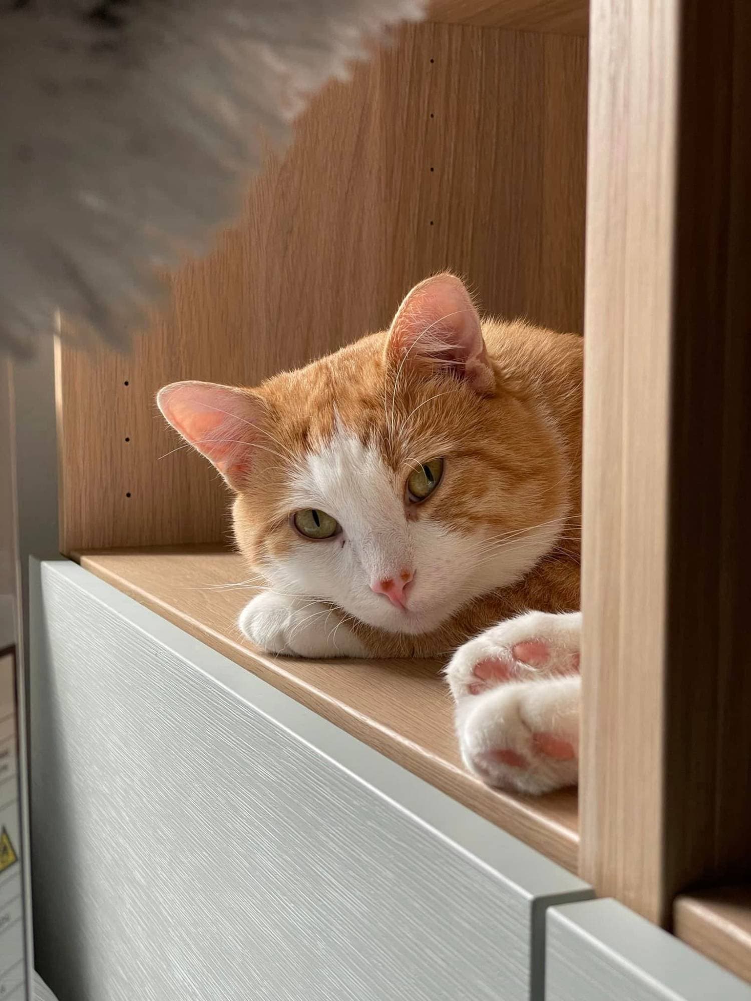
    Tusse, a ginger and white cat, resting his head on his paws on a bookshelf.

    Warehouse Manager

    Tusse

    Came home with me from a cat shelter in 2022, when he was about two years old. Now he runs the warehouse for Naughtypanda.se, and no box arrives without a thorough inspection.

    Dark mode

    This is me

    Digital marketer and business developer based in Helsingborg, Sweden, where I live with my cat Tusse. 15 years in retail, travel and hospitality, most of them in digital. I built my first websites at 15. I started my first web design business at 16. It had three clients. I’m not a developer (anymore), but this one I’m building myself in Next.js using AI, to learn something new.

    I spot details quickly, and probably point them out a bit too often. Give me a problem nobody really knows how to solve, and I’m happy to nerd out on it.

    Outside work it’s a lot of travel and digital projects, often more than I have time for. One of them is my webshop Naughtypanda.se, with gifts that have a cheeky twist, which I run on my own on the side. Every now and then I play some World of Warcraft or get lost in Transport Fever or Satisfactory.

    Tusse, a ginger and white cat, resting his head on his paws on a bookshelf.

    Warehouse Manager

    Tusse

    Came home with me from a cat shelter in 2022, when he was about two years old. Now he runs the warehouse for Naughtypanda.se, and no box arrives without a thorough inspection.

  • Filled box

    Purpose
    Colored accent surfaces: number boxes, widgets (Spotify card and WoW card in Off the clock) and the contact block. A few per view at most.
    Tokens
    Color names directly, text always in the box’s text color. Number boxes teal, plum, wine with offwhite and the source line in --highlight; box 4 --number-4-*. --r-lg, inner space --space-5. Widgets plum and teal, --r-xl, --card-pad. Large headings offwhite, pastel only for small texts.
    Variants
    Number box 1–4. A box can take its value live from a source (source in numbers.md): Mounts collected in Azeroth comes from Blizzard once a day, with 276 as fallback, and its source line says so (Data from Blizzard). Widget plum (Spotify card) and teal (WoW card), shown under Off the clock.

    Light mode

    Very important numbers

    • 67Boxes inspected by TusseGive or take.
    • 312Mounts collected in AzerothData from Blizzard
    • 399 hBuilding factories in SatisfactoryLet me just do this one thing.
    • 9Cinnamon buns eaten in 2026Counted by hand. Honestly.

    Dark mode

    Very important numbers

    • 67Boxes inspected by TusseGive or take.
    • 312Mounts collected in AzerothData from Blizzard
    • 399 hBuilding factories in SatisfactoryLet me just do this one thing.
    • 9Cinnamon buns eaten in 2026Counted by hand. Honestly.
  • Off the clock: Spotify card, Coffee card (new), WoW card

    Purpose
    The Off the clock row (v2.0): Section title, then three cards on a Full-width band – Spotify card, Coffee card, WoW card. Static examples here: the covers are color boxes and the render a placeholder. On the home page the data comes from Spotify and Blizzard, cached for a day.
    Tokens
    Three cards in a row or one column, never 2 + 1 (a flex-basis formula with flex-wrap, minimum width 300 px, --space-5 between). All cards --card-pad, --r-xl (leaf shape). Meta line (small, --fs-xs) at the top, then a Card title. Spotify card: Filled box in plum. Spotify’s icon in white at the top right, 24 px (at least 21), unmodified, --space-4 clear space to the text. Four tracks in 2 × 2: cover 1:1, uncropped, 4 px corners (8 px from 64rem), nothing on top; title in Montserrat Bold --fs-sm, offwhite; artist in a Meta line (small), pastel. The whole track links to Spotify; hover underlines the title (2 px) like a Plain link. Coffee card (new): a Surface (--bg on the band). Four rows from content/en/coffee.md: an uppercase label like the Eyebrow (--fs-xs, Bold, letter-spacing 0.08em, --text-muted) and the value in Montserrat Bold --fs-body-sm, --text, divided like a Divided list row (--space-3 above and below). Under the rows a cut-out photo of the bag (transparent PNG, image in coffee.md, optional) fills the height left in the card, at least 14rem, --space-5 above, aligned to the bottom. No date, no Fallback state. WoW card: Filled box in teal. The character’s name as Card title, offwhite; "Level 80 Druid · Doomhammer" in a Meta line, pastel; the full-body render (Blizzard’s main-raw, transparent PNG) in a box that takes the height left in the card (at least 18rem, --space-4 above) and reaches into the card’s padding on the sides; the image is scaled so the character fills the box and only its transparent edges are cut; the source line "Data from Blizzard" at the bottom, --fs-xs, pastel. Images are served through next/image from our own server.
    Variants
    Fallback state is shown in the next example.

    Light mode

    Off the clock

    Coffee

    Brewing right now

    • Beans

      Jorge Diaz Campos, Peru

    • Roaster

      Morgon Coffee Roasters, Gothenburg

    • Method

      Pour-over, V60

    • Notes

      Juicy, forest berries, cacao nibs
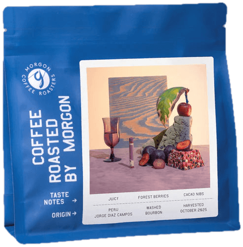
    A bag of Jorge Diaz Campos from Morgon Coffee Roasters

    World of Warcraft · Current main · Moo

    Thildir

    Level 80 Druid · Doomhammer

    [Character render from Blizzard]

    Data from Blizzard

    Dark mode

    Off the clock

    Coffee

    Brewing right now

    • Beans

      Jorge Diaz Campos, Peru

    • Roaster

      Morgon Coffee Roasters, Gothenburg

    • Method

      Pour-over, V60

    • Notes

      Juicy, forest berries, cacao nibs

    A bag of Jorge Diaz Campos from Morgon Coffee Roasters

    World of Warcraft · Current main · Moo

    Thildir

    Level 80 Druid · Doomhammer

    [Character render from Blizzard]

    Data from Blizzard

  • Fallback state (new principle)

    Purpose
    When an API does not answer, the card stays: Meta line, Card title, logo and source line remain, and the data part is replaced by one line. Not a Placeholder: that is for content missing while building.
    Tokens
    One line in Gelasio Italic --fs-body-sm, offwhite, --space-4 above. Spotify: "Spotify isn’t answering right now. Safe to assume I’m still listening." WoW: "Can’t reach Azeroth right now. Thildir is probably out hunting for another mount." The Coffee card is static and has none.
    Variants
    On preview deployments (and locally), ?fallback=spotify,wow on the home page forces it, one card or both. In production the parameter does nothing.

    Light mode

    Off the clock

    Spotify · Last 4 weeks

    On repeat lately

    Spotify isn't answering right now. Safe to assume I'm still listening.

    Coffee

    Brewing right now

    • Beans

      Jorge Diaz Campos, Peru

    • Roaster

      Morgon Coffee Roasters, Gothenburg

    • Method

      Pour-over, V60

    • Notes

      Juicy, forest berries, cacao nibs

    A bag of Jorge Diaz Campos from Morgon Coffee Roasters

    World of Warcraft · Current main · Moo

    Thildir

    Can't reach Azeroth right now. Thildir is probably out hunting for another mount.

    Data from Blizzard

    Dark mode

    Off the clock

    Spotify · Last 4 weeks

    On repeat lately

    Spotify isn't answering right now. Safe to assume I'm still listening.

    Coffee

    Brewing right now

    • Beans

      Jorge Diaz Campos, Peru

    • Roaster

      Morgon Coffee Roasters, Gothenburg

    • Method

      Pour-over, V60

    • Notes

      Juicy, forest berries, cacao nibs

    A bag of Jorge Diaz Campos from Morgon Coffee Roasters

    World of Warcraft · Current main · Moo

    Thildir

    Can't reach Azeroth right now. Thildir is probably out hunting for another mount.

    Data from Blizzard

  • Divided list row

    Purpose
    A list with rows separated by a line: the experience list, the Courses list, the Now & next rows and the contact rows. One shared style, .divided-list.
    Tokens
    1 px divider in --accent-line only between the rows, none below the last. Row spacing --space-5. In the contact block (filled box, wine) the divider is plum via --divider.
    Variants
    The contact block: wine, --r-2xl, inner space --space-block, space below --space. Heading offwhite, email (hello@hampusmalmstrom.se) and LinkedIn in pastel, icon boxes plum with the icon in pastel, focus ring pastel. Hover (mouse only): 2 px underline 4 px from the text, in the text’s pastel.

    Light mode

    Say hej.

    Email is the quickest way to reach me, and I’m always happy to grow my network on LinkedIn.

    Dark mode

    Say hej.

    Email is the quickest way to reach me, and I’m always happy to grow my network on LinkedIn.

  • Lines above/below row

    Purpose
    Frames the row with the four traits.
    Tokens
    1 px in --accent-line-soft above and below, space --space-6. Dots 34 px.

    Light mode

    • Brand & customer experience
    • Product ownership & digital development
    • Connecting business & technology
    • Runs on coffee and cinnamon buns

    Dark mode

    • Brand & customer experience
    • Product ownership & digital development
    • Connecting business & technology
    • Runs on coffee and cinnamon buns
  • Full-width band

    Purpose
    A background across the full width behind a section – here Experience and Courses side by side and Tools below, with logo boxes and the experience list.
    Tokens
    --surface across the full width, the content in .wrap (max --max, page margin --gutter). Width 100 %: .band is a container, which otherwise has no width of its own. Space --space above and below.
    Variants
    Logo box M: the employer’s logo fills the whole box in the leaf shape; without a logo it is filled with initials in offwhite.

    Light mode

    Experience

    • Room Republic

      Digital Marketing Specialist · Helsingborg

      2025 – 2026

    • Emirates Holidays

      Marketing Manager, then Sales & Service Manager · Copenhagen
      2019 – 2025

    • Salling Group · Netto

      From finance to digital · Falkenberg, Køge & Aarhus

      2011 – 2019

    Full work history on LinkedIn →

    Courses

    • CX Platform Strategy

      IHM Business School

      Ongoing

    • Process Design & Facilitation

      Hyper Island

      2018

    • Project Management

      Implement Consulting Group

      2018

    Tools

    • Salesforce Marketing Cloud (CRM & customer experience)
    • GA4 (Analytics & performance)
    • WordPress (Web & platforms)
    • Claude (AI & ways of working)
    • Photoshop (Design & creative)
    • Salesforce Service Cloud (CRM & customer experience)
    • Google Tag Manager (Analytics & performance)
    • Umbraco (Web & platforms)
    • Claude Code (AI & ways of working)
    • Illustrator (Design & creative)
    • Emarsys (CRM & customer experience)
    • Google Ads (Analytics & performance)
    • Shopify (Web & platforms)
    • ChatGPT (AI & ways of working)
    • InDesign (Design & creative)
    • Klaviyo (CRM & customer experience)
    • Meta Ads (Analytics & performance)
    • Squarespace (Web & platforms)
    • Jira (AI & ways of working)
    • Lightroom (Design & creative)
    • Zendesk (CRM & customer experience)
    • MicroStrategy (Analytics & performance)
    • HTML & CSS (Web & platforms)
    • Confluence (AI & ways of working)
    • Canva (Design & creative)
    • MailerLite (CRM & customer experience)
    • Next.js (Web & platforms)
    • Notion (AI & ways of working)
    • GitHub (Web & platforms)
    • Trello (AI & ways of working)
    • Vercel (Web & platforms)
    • Scrum & Kanban (AI & ways of working)

    Dark mode

    Experience

    • Room Republic

      Digital Marketing Specialist · Helsingborg

      2025 – 2026

    • Emirates Holidays

      Marketing Manager, then Sales & Service Manager · Copenhagen

      2019 – 2025

    • Salling Group · Netto

      From finance to digital · Falkenberg, Køge & Aarhus

      2011 – 2019

    Full work history on LinkedIn →

    Courses

    • CX Platform Strategy

      IHM Business School

      Ongoing

    • Process Design & Facilitation

      Hyper Island

      2018

    • Project Management

      Implement Consulting Group

      2018

    Tools

    • Salesforce Marketing Cloud (CRM & customer experience)
    • GA4 (Analytics & performance)
    • WordPress (Web & platforms)
    • Claude (AI & ways of working)
    • Photoshop (Design & creative)
    • Salesforce Service Cloud (CRM & customer experience)
    • Google Tag Manager (Analytics & performance)
    • Umbraco (Web & platforms)
    • Claude Code (AI & ways of working)
    • Illustrator (Design & creative)
    • Emarsys (CRM & customer experience)
    • Google Ads (Analytics & performance)
    • Shopify (Web & platforms)
    • ChatGPT (AI & ways of working)
    • InDesign (Design & creative)
    • Klaviyo (CRM & customer experience)
    • Meta Ads (Analytics & performance)
    • Squarespace (Web & platforms)
    • Jira (AI & ways of working)
    • Lightroom (Design & creative)
    • Zendesk (CRM & customer experience)
    • MicroStrategy (Analytics & performance)
    • HTML & CSS (Web & platforms)
    • Confluence (AI & ways of working)
    • Canva (Design & creative)
    • MailerLite (CRM & customer experience)
    • Next.js (Web & platforms)
    • Notion (AI & ways of working)
    • GitHub (Web & platforms)
    • Trello (AI & ways of working)
    • Vercel (Web & platforms)
    • Scrum & Kanban (AI & ways of working)
  • Courses list

    Purpose
    The course list next to Experience on the band (when the band is at least 63rem wide); Tools sits below both at full width. Also shown in the Full-width band above.
    Tokens
    Built like the experience list: Section title (compact), Divided list row (.divided-list, --accent-line), Icon box M (--r-md) with initials in offwhite on teal, plum or wine as the fallback. Course name in --fs-title Bold, school in --text-secondary --fs-body-sm (Gelasio), years in a Meta line (--meta, --fs-sm). Row spacing --space-5.
    Variants
    Three rows, the three most recent. When the band is at least 63rem wide (a 64rem screen minus the scrollbar) Experience and Courses share row heights (subgrid), so the dividers line up. The years sit on the right when the row is at least 32rem wide, otherwise below the text, in the text’s column. A narrower band, for example a box here in /design, stacks the lists: the band decides, not the screen. The example shows the list after the course has ended (years instead of Ongoing).

    Light mode

    Courses

    • CX Platform Strategy

      IHM Business School

      2026 – 2027

    • Process Design & Facilitation

      Hyper Island

      2018

    • Project Management

      Implement Consulting Group

      2018

    Dark mode

    Courses

    • CX Platform Strategy

      IHM Business School

      2026 – 2027

    • Process Design & Facilitation

      Hyper Island

      2018

    • Project Management

      Implement Consulting Group

      2018

  • Ongoing row

    Purpose
    A variant of the Divided list row (formerly Ongoing course, Build page v1.4): a row that is in progress shows a Live dot and a status text instead of years or a date. Used in Courses. The rows in Now & next on /build are not Ongoing rows (changed 2026-10-22): they show their status as text in a Meta line, and the Live dot sits on the version's Eyebrow.
    Tokens
    Live dot (.leaf-dot.live-dot, 10 px, --primary) and the status text in a Meta line (--meta, --fs-sm, Medium Italic) in the right-hand column, --space-2 between. The dot is decorative (aria-hidden), the text is enough for screen readers. The row is as tall as the other rows. The component is OngoingStatus.
    Variants
    "Ongoing" in Courses. A course counts as ongoing when it has no end date or the end date has not passed (content/courses/, the end date of the last week; otherwise the last year of the period up to and including 31 Dec), after that the years are shown. The course file decides. Reduced motion: no ring. A current employer gets no dot, only "Since 20XX".

    Light mode

    Courses

    • CX Platform Strategy

      IHM Business School

      Ongoing

    • Process Design & Facilitation

      Hyper Island

      2018

    • Project Management

      Implement Consulting Group

      2018

    Dark mode

    Courses

    • CX Platform Strategy

      IHM Business School

      Ongoing

    • Process Design & Facilitation

      Hyper Island

      2018

    • Project Management

      Implement Consulting Group

      2018

  • Build page (v1.4)

    The page /build. It is built from existing components; new are Step row, Icon box in the Version variant and Decision note. The Article title is used here too, outside the story page. The footer links and the link from /build to this design system are all Plain links. /privacy uses the Page header, Card title for its sections, body text and a Meta line; it adds no component.

  • Article title

    Purpose
    The page heading for /build and /privacy (and the story page): large, calm and without a bar. The bar is the Section title’s signature. Page header: Article title and Subtitle, left-aligned in .wrap.
    Tokens
    Montserrat Black 900, --fs-display (40–68), --lh-display, --card-title. No text-transform: capitals stay as written. Subtitle as in the hero: --fs-hero-sub, --subtitle, max 40ch. Space above --space-block. No meta line.

    Light mode

    How I build this site

    I run the project, Claude Code writes the code.

    Dark mode

    How I build this site

    I run the project, Claude Code writes the code.

  • Step row

    Purpose
    A new variant of the Divided list row in How I build it. The signature of /build: every step shows who does it. The page also ends this section with a Plain link to this design system.
    Tokens
    Number in a Meta line (--meta) on the left, since it is a real sequence. The step as a small Card title (--fs-lead, ExtraBold), one line of Gelasio in --fs-body-sm, --text-secondary. Who does the step as a Tag (--fs-xs, --r-xs, --accent-line): Me, Claude or Claude Code, several tags if several do it. The tool in a small Meta line (--fs-xs). Row spacing --space-5.
    Variants
    The row is a container: from 44rem wide, tags and tool sit in a right-hand column (12rem), otherwise below the text. When the component is at least 64rem wide the steps run in two columns, column 1 filled first (1–4 left, 5–7 right), and rows 1 and 5, 2 and 6 and so on share height so the dividers line up; below that, one column. The number and the dividers line up with the left edge like the other lists. Sits on a Full-width band.

    Light mode

    How I build it

    1. 1

      Idea

      It starts with something I want to see on the site.

      • Me
    2. 2

      Sparring and decisions

      Claude grills the idea, round after round, before anything is decided.

      • Me
      • Claude

      Claude (chat)

    3. 3

      Backlog

      Every decision becomes a card, tied to a version on the roadmap.

      • Me

      Notion

    4. 4

      Brief

      Claude writes one set of instructions for Claude Code.

      • Claude

      Google Drive

    1. 5

      Build

      Claude Code builds on its own branch and reports back, assumptions included.

      • Claude Code

      GitHub

    2. 6

      Review

      I go through a preview of the change and send feedback.

      • Me

      Vercel preview

    3. 7

      Release

      When I approve, the change is merged and goes live.

      • Me

      Vercel

    Dark mode

    How I build it

    1. 1

      Idea

      It starts with something I want to see on the site.

      • Me
    2. 2

      Sparring and decisions

      Claude grills the idea, round after round, before anything is decided.

      • Me
      • Claude

      Claude (chat)

    3. 3

      Backlog

      Every decision becomes a card, tied to a version on the roadmap.

      • Me

      Notion

    4. 4

      Brief

      Claude writes one set of instructions for Claude Code.

      • Claude

      Google Drive

    1. 5

      Build

      Claude Code builds on its own branch and reports back, assumptions included.

      • Claude Code

      GitHub

    2. 6

      Review

      I go through a preview of the change and send feedback.

      • Me

      Vercel preview

    3. 7

      Release

      When I approve, the change is merged and goes live.

      • Me

      Vercel

  • Now & next and Built with

    Purpose
    Now & next: open and planned versions, one group per version with an Eyebrow. Built with: the tool and what it is used for. Both are shown here.
    Tokens
    Now & next: an Eyebrow per version (--fs-sm, Bold, letter-spacing 0.08em, --text-muted). Version in progress: "In progress: v1.4" with a Live dot on the Eyebrow and a Divided list row (name --fs-body Bold, status as text in a Meta line on the right, no dot: "Live · 22 Oct", "In progress" or "Next"). The Live dot sits on the version, never on the rows (changed 2026-10-22): one dot per thing in progress. Several versions in progress get one dot each. The groups are sorted ascending by version number. Goal line: one line about the version’s goal directly under the Eyebrow (Gelasio --fs-body-sm, --text-secondary). A planned version ("Planned: v3.0", no dot) has only the goal line, no list. The version up next is shown the same way with "Next" on the Eyebrow ("Next: v2.1", no dot). A version in progress with a goal shows the goal line and then the rows; small fix versions have no goal line. The goal does not follow to Shipped. Built with: the tool name as a Plain link to the tool’s official site, in Montserrat Bold --fs-body-sm, the use in Gelasio --fs-body-sm (--text-secondary), row spacing --space-4.
    Variants
    Built with runs in two columns when the component is at least 64rem wide (column 1 filled first), otherwise in one. The rows in the two columns share height (subgrid), so the dividers line up. Name and text sit side by side when the row is at least 32rem wide, with a name column as wide as the longest name (the same in both columns); below that the name sits above the text. No affiliate links.

    Light mode

    Now & next

    Next: v2.1

    A way to show where I've been: places I've travelled to, and destinations I've sold during my years in travel.

    Planned: v3.0

    Stories from my career, with more of the how and why than a CV has room for. Plus the numbers on the home page shuffle on every visit.

    Built with

    • Next.js

      The framework the site is built on

    • Vercel

      Hosting, and a preview of every change

    • GitHub

      The code, with every change as a pull request

    • Claude

      Sparring partner and author of the briefs

    • Claude Code

      Writes the code

    • Notion

      Backlog, roadmap, decisions and the site’s copy

    • Google Drive

      Where briefs, reports and images change hands

    • Lucide

      The icons

    • Google Fonts

      Montserrat and Gelasio

    • Vercel Web Analytics

      Visitor stats, no cookies needed

    Dark mode

    Now & next

    Next: v2.1

    A way to show where I've been: places I've travelled to, and destinations I've sold during my years in travel.

    Planned: v3.0

    Stories from my career, with more of the how and why than a CV has room for. Plus the numbers on the home page shuffle on every visit.

    Built with

    • Next.js

      The framework the site is built on

    • Vercel

      Hosting, and a preview of every change

    • GitHub

      The code, with every change as a pull request

    • Claude

      Sparring partner and author of the briefs

    • Claude Code

      Writes the code

    • Notion

      Backlog, roadmap, decisions and the site’s copy

    • Google Drive

      Where briefs, reports and images change hands

    • Lucide

      The icons

    • Google Fonts

      Montserrat and Gelasio

    • Vercel Web Analytics

      Visitor stats, no cookies needed

  • Icon box, variant Version

    Purpose
    A new variant of Icon box M in Shipped: the version number instead of initials. Shown here together with the Shipped rows.
    Tokens
    Icon box M (52 px, --r-md) filled in plum, teal or wine in turn, newest first. The version number without the "v" ("1.2") in Montserrat ExtraBold, --fs-sm, offwhite. The version’s name as a Card title (--fs-title), the date right-aligned in a Meta line, 2–5 lines in Gelasio --fs-body-sm (--text-secondary) as a list with small Leaf dots (8 px, --dot-2) as bullets. Built like the experience list.
    Variants
    Newest first. The date is the day the version was closed, from CHANGELOG.md.

    Light mode

    Shipped

    • Version 2.0: Off the clock

      • A new row on the home page with my most played songs on Spotify, the coffee I’m brewing right now and my World of Warcraft character.
      • The songs come straight from Spotify. The coffee I update by hand.
      • Images load through the site itself, so your IP address isn’t sent to Spotify or Blizzard.
      • A version in progress on this page now gets a live dot.

      Decision: If Spotify or Blizzard doesn’t answer, the cards stay put and show a cheeky line instead of going blank.

    • Version 1.6: Privacy and a new order

      • A short privacy page, linked in the footer.
      • Off the clock is up next, and the stories moved to v3.0.
      • The design system uses English names throughout.

    • Version 1.5: Links and tidier lists

      • Naughtypanda.se in the text about me is now a link.
      • The tools under Built with link to their websites.
      • Two-column lists now line up row by row.
      • Versions in progress show their goal, not just the work.

    • Version 1.4: Showing the work

      • This page, with how the site gets built and what’s coming next.
      • The design system is now in English.
      • A link to this page in the footer.

    • Version 1.3: Small fixes after QA

      • Clicking my name in the header from another page now lands at the very top of the home page.
      • The menu links no longer flicker when switching between light and dark mode.
      • The page no longer shifts when the birds load.

    • Version 1.2: A home for lost pages

      • Pages that don’t exist now end up with Tusse, in an empty box.
      • Courses sit next to Experience, with the current one marked Ongoing.
      • The strengths at the top of the home page have new texts.
      • A live dot in the status line shows that I’m open to new roles right now.
      • A little more breathing room on the sides on mobile.

      Decision: The 404 page got one of the site’s birds at first. It pushed the content down on mobile, so it flew off again.

    • Version 1.1: Day-one polish

      • Shared links now show the same heading and subtitle as the page.
      • Small fixes to copy and spacing after launch day.

    • Version 1.0: First version live

      • Who I am, a few numbers, experience, tools and how to reach me.
      • Light and dark mode, and your choice is remembered without cookies.
      • Findable in search, with its own title, description and share image.
      • Visits are measured without a cookie banner.

      Learned: A living design system and a rulebook keep the design consistent, however many chats are involved.

    Dark mode

    Shipped

    • Version 2.0: Off the clock

      • A new row on the home page with my most played songs on Spotify, the coffee I’m brewing right now and my World of Warcraft character.
      • The songs come straight from Spotify. The coffee I update by hand.
      • Images load through the site itself, so your IP address isn’t sent to Spotify or Blizzard.
      • A version in progress on this page now gets a live dot.

      Decision: If Spotify or Blizzard doesn’t answer, the cards stay put and show a cheeky line instead of going blank.

    • Version 1.6: Privacy and a new order

      • A short privacy page, linked in the footer.
      • Off the clock is up next, and the stories moved to v3.0.
      • The design system uses English names throughout.

    • Version 1.5: Links and tidier lists

      • Naughtypanda.se in the text about me is now a link.
      • The tools under Built with link to their websites.
      • Two-column lists now line up row by row.
      • Versions in progress show their goal, not just the work.

    • Version 1.4: Showing the work

      • This page, with how the site gets built and what’s coming next.
      • The design system is now in English.
      • A link to this page in the footer.

    • Version 1.3: Small fixes after QA

      • Clicking my name in the header from another page now lands at the very top of the home page.
      • The menu links no longer flicker when switching between light and dark mode.
      • The page no longer shifts when the birds load.

    • Version 1.2: A home for lost pages

      • Pages that don’t exist now end up with Tusse, in an empty box.
      • Courses sit next to Experience, with the current one marked Ongoing.
      • The strengths at the top of the home page have new texts.
      • A live dot in the status line shows that I’m open to new roles right now.
      • A little more breathing room on the sides on mobile.

      Decision: The 404 page got one of the site’s birds at first. It pushed the content down on mobile, so it flew off again.

    • Version 1.1: Day-one polish

      • Shared links now show the same heading and subtitle as the page.
      • Small fixes to copy and spacing after launch day.

    • Version 1.0: First version live

      • Who I am, a few numbers, experience, tools and how to reach me.
      • Light and dark mode, and your choice is remembered without cookies.
      • Findable in search, with its own title, description and share image.
      • Visits are measured without a cookie banner.

      Learned: A living design system and a rulebook keep the design consistent, however many chats are involved.

  • Decision note

    Purpose
    New: 0–2 short notes per version in Shipped, below the lines. Shows a decision or a lesson. Shown in the Shipped example above, and here on its own.
    Tokens
    Gelasio Italic, --fs-body-sm, --lh-snug, --text-secondary. Starts with "Decision:" or "Learned:" in the same style. No box, no icon. --space-3 above.

    Light mode

    Decision: pages are built from existing components, and a new one is written into the rules first.

    Dark mode

    Decision: pages are built from existing components, and a new one is written into the rules first.

  • Purpose
    The last line of every page: the copyright line and the links to /build and /privacy.
    Tokens
    --fs-sm SemiBold, --text-muted, --space-7 below. The link is a Plain link on the right, on the same row as ©: /build first, then /privacy, a gap of --space-5 between.
    Variants
    The links wrap to their own row when they do not fit.

    Light mode

    Dark mode

  • Bird

    Purpose
    The signature. Decoration in edges and corners – one or two visible at a time at most.
    Tokens
    The original files in public/brand/, unchanged. Switches to the -mork files in dark mode via --when-light / --when-dark. Every image has width and height from the file’s viewBox, so the page does not jump when the image loads.
    Variants
    Duo (hero), trio (contact) and par (not used on any page right now).

    Light mode

    Dark mode

  • Purpose
    Shows where the keyboard is, selected text and the shortcut past the header.
    Tokens
    Focus ring 3 px in --primary, 3 px from the element (pastel in the contact block). Selected text: background --accent-line, text --text. Skip link: --button-bg / --button-text, Montserrat Bold, --r-sm.
    Variants
    Tab to the button to see the focus ring, select the text to see the selection. The skip link is shown here without being hidden.

    Light mode

    Select this sentence.

    Dark mode

    Select this sentence.

  • Share image

    Purpose
    The image shown when someone shares the site on LinkedIn, Slack and so on. A cutout of the hero, so that whoever clicks recognizes it.
    Tokens
    1200 × 630 px, drawn without CSS in app/opengraph-image.tsx. Background offwhite. Portrait in the leaf shape with no frame and the duo bird, at the hero measurements × 1.5 (photo 360 × 450 px, radius 132 px = --r-portrait × 1.5). Heading Montserrat Black, uppercase, teal. Subtitle Montserrat Bold, plum. The texts are read from the hero.
    Variants
    Always light mode – the same image in both panels. No frame, bottom bar, status line, button or heading bar.

    Light mode

    The share image: the portrait with the bird and the heading Hejsan, I’m Hampus.

    Dark mode

    The share image: the portrait with the bird and the heading Hejsan, I’m Hampus.

Placeholders

  • Placeholder

    Purpose
    Missing content is written in [square brackets] with a dashed border until it exists. Must not show on the home page in v1.
    Tokens
    Inherits the text color, 1 px dashed border in currentColor, 2 px from the text. Square corners.
    Variants
    In running text, in toned image slots ([Image], not shown on mint or pastel).

    Light mode

    Side project · [Since year]

    [Image]

    Dark mode

    Side project · [Since year]

    [Image]